To make a blog
Hello world! It seems fitting that my first psot should be about making the blog itself.
Online or offline?
In this day and age, there are so many options to run a blog. First in line are the easy online services. Just go to Substack, Medium, or Blogger and get started right away. For me, that comes with several drawbacks. They are all closed platforms. Should I decide to migrate, it's not impossible, but definitely not without pain. The other issue is limited flexibility—you can only change what the service provider allows you to change. Finally, most providers are for-profit corporations and I'm slightly afraid that they would try to constantly offer me things that I don't need, such as to “improve this article using AI”.
If we're not talking services, then next up are the Content Management Systems (CMS), notably Wordpress. It offers unparalleled flexibility and can be self-hosted or 3rd party hosted. In any case, the data is yours and you can just migrate them to another WP provider if you need to. On the other hand, running Wordpress requires considerable compute resources and I would think that for a site such as this, it's an overkill.
Considering all that, my instinct would take me to explore static site generators. There were two contestants: Jekyll and Publii. I tried both and Publii won. It seemed more straightforward while at the same time more user-friendly. It's an app that runs on your computer, much like a text editor and allows you to manage the whole site. When you're happy, just “bake” the site into a static set of pages and upload them to any web hosting provider. The site will be blazing fast—no need to wait for content generation on each visit! And, at the same time, there's no “admin panel” or anything other than the site itself. You can edit it on the go, because it's an offline app. Finally, the site content can be version-controlled using git.
Fine details of the design
Publii offers many ready-made themes, and I immediately liked the Terminal theme. But it was also clear that I will need to customize it. Fortunately, this is very straightforward. Publii allows for “theme overrides” where you can change just the required bits. My first customization was the font. The default font for the Terminal is JetBrains Mono, while my taste lies with Anonymous Pro. They are both monospace fonts. The differences is in how “round” they feel, and of course the eternal dispute of whether zero should be crossed out or dot in middle. You can see the difference below:

Anonymous pro is also a bit serif-y, so it suits better long blocks of text such as a blog article. To improve further, I have enabled full width justification and hyphenation of the text. This makes each line's inter-word spacing slightly different and thus breaks the impression of a fixed-width font.
Because the site itself is in monospace, I wanted to make the logo stand out with an even more “computer” font. I picked the original 8x8 pixel font from IBM PCs. It has a distinct “square” look that is not very common these days. When you start a desktop computer, the BIOS will boot using an 8x16 or 9x16 pixels fixed-width font. This font is also used if you remain in text mode, such as when you boot into DOS or Linux without full graphics support. The text mode font can be switched to 8x8 pixels—as in the logo—which will result in getting 50 lines of text on the screen instead of just 25. In the 1990s, I spent almost all my time using a text mode screen exactly like this. The font is part of VileR's Ultimate Oldschool PC Font Pack.
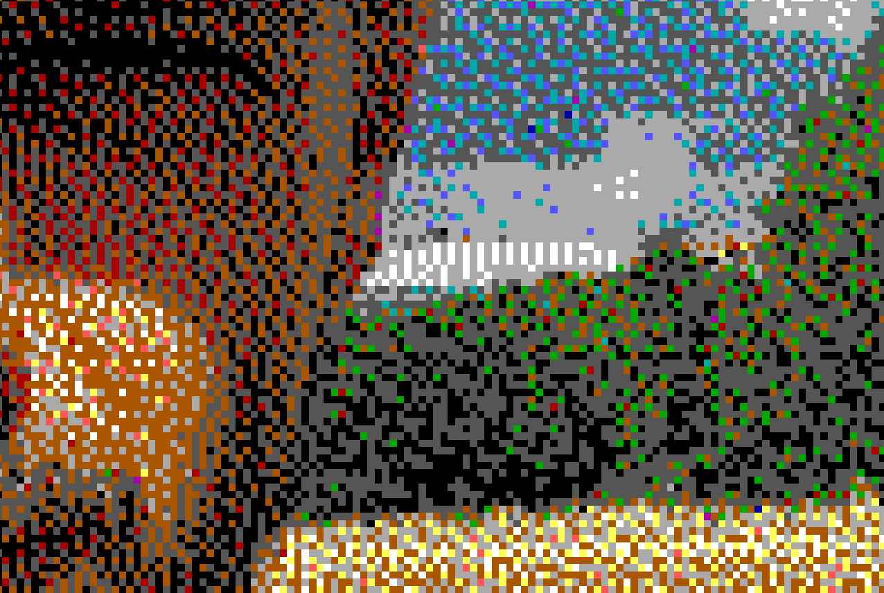
To amplify the oldschool look of the site, I have tweaked my photo using GIMP. Mainly, I reduced the number of colors and used dithering to create an illusion of color depth. The image uses only 16 distinct colors! You can see the trickery when you zoom the pixels:
Next, I tackled the issue of screen width and content width. Modern screens are too wide to be fully filled with text. Web sites usually only have a narrow column reserved for the main text and fill the rest of the screen with various sidebars, advertisements, etc. I don't have any of the filler components, so I just created a low contrast background to make the screen feel more “full” despite the narrow text column in the center.
Finally, I added a few CSS animations to bring the site to life. But I believe you've discovered these yourself already! Enjoy!